Delta Airlines...in Diapers?!
 My buddy, Karl Long picked this up before me, because I didn't check into Ze Frank's vlog yesterday. Evidently, Delta airlines has upset poor Ze...and he's letting the world know in the way only he can.... with adult diapers, hysterical insults and poignant commentary.
How many times have you wanted to do something like this out of sheer frustration with a company!? Well, now you can.
Yet another lesson in managing customers effectively and the impact of social networking. Vive el ze!
the show with zefrank
Enjoy!
Good readin': The Lifespan of the CMO
 Great article this morning in Advertising Age on the average lifespan of a Chief Marketing Officer. The article cites a study by Spencer Stuart, which says that the lifespan of the average CMO shrunk slightly from 23.6 to 23.2 months this year.
 The story cites some interesting reasons for the "alarmingly short" CMO lifespan, including pressure to perform, being hindered by the CEO, short-term demands of Wall Street and executive "poaching." This may validate things many of us intuitively know.
I had some thoughts as I perused this article... First, I couldn't help but carefully consider this quote from Jeff Bell, VP Global Marketing at Microsoft's Interactive Entertainment Business:
"The shorter tenure is in part a reflection of the change from failing traditional-marketing approaches to less-defined and more dynamic approaches...Clearly the skill set of CMOs is changing from 'TV, TV and more TV' to interactive media. ... As the world of marketing completes this transition, the tenure will stabilize."
Couple thoughts...
First, what is "less defined and more dynamic?" In the new marketing paradigm, if marketing is more dynamic, then shouldn't it then be even MORE defined - so that the organization can be proactively prepared to meet the customer's need with agility?
Next, I respectfully assert that it's important to realize is that it's not just about interactive media these days. I agree that executives who don't understand how to leverage the principles of interactive media will be left behind. However, marketers who think only with a new media mindset may very well miss out on the critical need to create synchronized experiences across online and offline channels that build brand cohesion and customer affinity. Further, they may neglect the very large portion of our consumer audience that is aging or elderly. These populations grew up on traditional media....and they've got a lot of buying power. So it's really about conversion and experience, in the end.
Finally, the job tenure may well stabilize over time. However, we can't forget that there's a lot of experimentation going on in traditional and emerging channels such as wireless. There will be a lot of trial and error - and with the error will come shakeout. So the stabilization may take a longer period of time than we may like to see. This may well be compounded by more than the short-term demands of Wall Street as well as the short-term mentality exhibited by many executives today.
The article cites the fact that most executives (53%) have been in their job less than one year. Only 25% will make it to the three year mark. The article references the "revolving door" syndrome, as a major brand threat today. I've witnessed this in client environments, where much of the continuity within the marketing department is driven by the third-party advertising agencies that have provided ongoing support. It's a sad thing when your agency knows more about your history than you do...
So what does it take to be a CMO superstar? Pointing to icons like Starbuck's Anne Saunders and Burger King's Russ Klein, Greg Welch, CMO and practice leader for Spencer Stuart asserts:
"We believe the new super CMO and examples on this list were true general managers before they took the CMO role," said Mr. Welch. "The complexity of this job, the ability to be board-savvy and work cross-functionally effectively are the attributes of new CMO," he said. "That may be the new model of CMO that can make it last and make it work."
There's more to read, just a few highlights. Feel free to peruse the article yourself!
Experience File: Kayak.com
 With all my business, wedding and family-visiting travel, I have been spending an inordinate amount of time searching for airline tickets lately. Even with modern search tools, the process can be laborious -- especially when coordinating people from different areas of the country. That's why, when I discovered Kayak.com, I decided to spread the word. My sentiments, in summary, are "hot dang, and hallelujia!"
 Kayak.com is a great study, which illustrates the real power of customer centricity in usability. My hope is that a tour of the site will remind all of you well intentioned business and marketing executives how important it is to "press the envelope" on usability in a proactive manner. It’s important to pay ongoing attention to user tasks and intentions to structure intuitive, usable and ergonomic tools that drive usage - and profitability.
The online travel booking arena has come a long way. However, it’s still rather easy to become dissatisfied with the search tools offered popular travel sites. While Orbitz.com, Travelocity and others offer rather robust search capabilities, they often place the impetus on users to do acrobatics to find what they really want. For instance, users must often start over, in order to "tweak" search listings to better "fit" with individual need. This often wastes time and energy, and can also produce frustration.
For example, say that I've posted a search on Orbitz.com. After doing so, I desire to "tweak" that search to filter for specific departure times. I’m forced to either scroll to view specific times, or start my search over to enter my departure criteria. This is cumbersome. From a task-based perspective it’s fairly common for a user not to be "ready" to "tweak" a search before viewing an initial “blanket” result. This challenge applies to a number of scenarios. For example, if I want to compare prices or flight times across the three airports out of which I often travel, I may have to conduct multiple searches.
While some of the sites offer helpful comparison grids illustrating fares out of several airports, or "fare alerts" that show lower fares into different airports, these aren't helpful, if you're comparing multiple search dimensions, such as price, departure time and airport. If I want to filter out certain airlines from my search, most of the time I will be forced to manually scroll (and scroll, and scroll) to obtain the information! If, in the context of these acrobatics, fare information is presented to me on several screens, the impetus is placed on me to remember the fares. This becomes more confusing as I age…
There's a reason that Kayak.com, was voted Travel & Leisure Magazine's top Travel Site in the category of "Search Aids". Boy, do they deserve it! The site is an ergonomic, robust, responsive mega search engine that is made for people like me and people like you.
Like the other travel sites, Kayak searches thousands airlines for low fares. However, it also searches low fares across travel sites, including CheapTickets.com, Orbitz, Travelocity, HotWire and others. That's rather convenient for those of us who have noted fare differences between those sites.
Beyond the scope of search, the real gem of Kayak.com, is the site's incredible attention to usability. The search tools, which serve as left-hand navigation, are entirely dynamic, allowing the user to customize every search with the simple use of slider bars and check boxes. Users can filter by number of stops, airline, airports, and adjust listings by price and flight departure times. Fabulous!

Using the side navigation, adding other airports to your search is a one-click process- the list will dynamically update based on your action. The default setting will always list the fares from lowest to highest. Want to narrow the search results by price or departure time? Just bump the slider bars to tailor the listing. Interested in showing only the flights after 7pm, do slide the departure time bar over and viola! The interface is simple, no-nonsense, and they'll link you to sites (including Orbitz) for fare purchase.
For those of us into "geek speak" you can find out how the braniacs at Kayak built the site just by visiting. They're very "open kimono" about things. For the quick version, they're using AJAX (no surprise), Java, Perl and Ruby, running on Linux. The site was developed on Mac. Click here for more information on technical construction. It doesn't end with the Kayak.com web site, either...Click here for other cool stuff they're experimenting with to enable you to use Kayak on your mobile phone, instant messenger desktop and other devices. They even have an app that ties Kayak to myspace.
Imagine what happens when Kayak functionality covers full-scale travel services, including hotels, car rental, packages, etc. It may not be long…
What does Kayak mean to the major travel sites? Well, for now, the relationship is symbiotic one. Kayak is actually augmenting the lack of search usability on other sites. In the future, however, who knows? Someone smart may purchase Kayak... or Kayak may get a huge round of VC and take over the world. Who knows...stay tuned.
In short, KUDOS to Kayak! These guys know the travel industry and they know technology. Most importantly, they know the customer and are providing the robust kind of search tool that can save consumers and small businesses time, money and effort. Wishing you every success, guys.
Experience Files: The Chop Shoppe
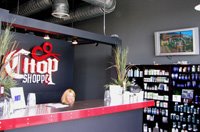
 Lately, I've been spending a lot of time with my fiancee, Brent in Sioux Falls, South Dakota. Experiencing new cities is always interesting, and finding small business that offer great experience is my equivilent of treasure hunting. This week, I encoutered a little experience gem we may well see more of in the future: Readers, meet "The Chop Shoppe," a funky, fun and very male grooming lounge in West Sioux Falls.
Let me preface my overview by saying that this experimentation was spawned by my ever practical cutie pie, who, like many bachelors, has his hair cut (ala electric razor) at a local discount barber for $10. The resulting coiff certainly isn't horrifying - just very often noticably uneven - especially to the discerning female.
Thus, when we passed the "The Chop Shoppe" coming back from the mall last week, I volunteered my hubby-to-be for a little experience research. He was a great sport about it, and here's what we discovered:
The Concept:
The Chop Shoppe is an unpretentiously cool destination for male grooming. Without a doubt, the owners know their clientelle: Everything there is guy friendly, from the name (it's a lounge, not a salon!), to the garage-inspired waiting area and the private "Detailing Rooms" which offer seclusion for other services such as "Sport Fascials." While it costs a bit more to get a Choppe than a razor cut from the barber, pricing isn't too much of a stretch: Chop Shoppe hair cuts are about $20, and other products are offeered for a reasonable price, as well.
The Environment:
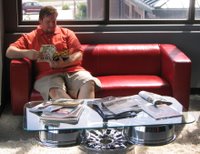
 Think "American Chopper" meets an upscale salon. The Chop Shoppe's lounge colors are red, black, grey and galvanized steel. A comfortable waiting room greets patrons, offering sleek leather seating and a very striking chrome and glass coffee table made out of mag wheels. Masculine details abound: Hang your coat on the gear-shift coatrack. Grab the paper from the tension mounted cable rack. Watch guy-friendly programming on one of several plasma screen televisions.
The Experience
 While ideally clients should be able to walk-in, the salon is booked several days in advance. It's best to make an appointment. Just check-in with the front desk and one of the lounge's very attractive staff members will invite you to relax in the waiting area. They'll also offer you a cold beverage.
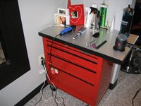
  Just beyond the waiting area, there are a number of workstations; each one featuring a red Craftsman toolbox workstation and a full-length mahogany mirror. After clients consult with a stylist, they are escorted to the wash area for a luxurious shampoo and head massage. Hair cuts are skillfully executed and take about 15 minutes to complete.
  Beyond the styling stations, several private "Detailing Rooms" offer comfort and seclusion for clients seeking other male grooming services, including face and body "detailing" such as fascials, massages and body waxing. There's nothing girly about the Chop Shoppe's very popular manicures and pedicures, either. Try the patented Margarita Pedicure. They'll soak your tootsies "on the rocks" (hot stones) in a lime bath. You'll sip a frothy virgin margarita as they lull you into paradise with a complete leg and foot massage - while scrubbing, buffing and smoothing rough areas to produce sparkling, well-groomed feet.
 Aestheticians and stylitsts are not only helpful with style and service selection, they're instrumental in introducing clients to new products. The salon also offers an array of quality men's products, including shampoo, conditioners and balms, skincare and fragrance. They'll assist with product selection and offer to set up a new appointment - recommended about every four weeks.
The Business
The Chop Shoppe is the brainchild of owner, Michelle Flanagan, a veteran stylist and entrepreneur. She seems passionate about providing a comfortable, guy-friendly and inviting environment for guys who need "a little help" with personal grooming. Michelle, who can be found chatting up clients and performing services, claims that a large majority of her clients gravitate to the salon for detailing services, including waxing, manicures and pedicures. The full-service aspect of the salon makes the Chop Shoppe a best kept secret for guys who want to look their best.
Michelle's flagship store is just six months old, and doing quite well. Regular customers jamming the books. The concept and name have been painstakingly trademarked, and plans for new salons are in the works. The business concept seems quite solid: Male haircuts take less time, and men tend to require haircuts and grooming more frequently than women. The add-on value of services and product add to profitability margin. All tolled, the Chop Shoppe a fertile market for growth and expansion. The concept should be especially appealing in major metropolitan areas.
The Verdict
So, what did my gearhead guy think? He'd definitely go back. He liked his haircut (and so did I). He loved the head massage. He thought the store concept (especially the mag wheel coffee table) was fun, cool and "very guy friendly." He even bought some "welding paste" for his new "doo" (at $18). Brent said he could see himself returning regular basis, provided he wouldn't "have to wait a long time" for service. His only other criticism pertained to the "lame" car magazines offered by the lounge. He plans to provide alternative suggestions when he returns next month.
All in all, the Chop Shoppe is a great concept store with a pleasing aesthetic and a keen focus on its customer base. As with any new business, the challenge will be managing business operations, growth and expansion without undermining customer experience. We wish Michelle the best of luck and optimistically look forward to witnessing her success.
Subscribe to:
Comments (Atom)
FAVORITES
- On Trust & Influence
- Don't be Social Media Sharkbait
- The Social Media Engagement Continuum
- 10 Tips for Twitter Unmarketing
- Five Experience Funamentals
- Experience & Branding: The Three Word Rule
- Get Some Experience Healing!
- Discovering Customer Experience Pitfalls
- Not My Job: The CX Enemy
- Shoe Carnival: Watch Out for Carnies!
- Bathroom Usability
RECENT COMMENTS
SEARCH
LEIGH DURST

I’m Leigh Durst, a 20 year veteran in business, operations, customer strategy, ecommerce, digital & social media and marketing. Simply put, I’m a strategist that helps companies (start-up to blue chip) achieve business shift, create more compelling online and offline experiences. I also write, speak and teach about experience design and next-generation business. I’m a futurist, visionary, strategist, doer and connector with a passion for people and helping others. When I’m not on the road, you’ll find me in the San Francisco bay area, working, beaching it and hanging out with my family and dog.
Labels
Best Practices
CX
Community
Content
Copy writing
Customer Experience Leaders
Customer Relationship Management
Defining Customer Experience Management
Ethics
Group Think
Harassment
Innovation
Plagiarism
Plurk
RESOURCES
Social Media
Social Media Expert
Twitter
UX
Web 2.0
Web Strategy
advertising
air travel
bank experience
bathrooms
branding
brick and mortar retail
charlene li
cottonelle
customer centricity
customer experience
customer experience files
customer experience management
customer experience pitfalls
customer experience; innovation;
customer research
economy
experience best practices
experience file
experience pitfalls
good customer experience
infrastructure
life
marketing
marketng
motherhood
old navy
personal
privacy
reinvention
restaurant experience
retail experience
security
social networking
starbucks
stuck
target
toilet paper
trust agents
trust continuum
usability best practices
user experience
user experience
word-of-mouth


